Friday, December 5, 2014


The Answers to the image riddle.
All images © mike cockcroft
Click on any image to see larger version.
If your interested in buying an art print of the above  up to 52cm x52cm you can contact me at admin@bitdepth.com.au

John Lennon is supposed to have chosen Jesus and Hitler as
his first choices for the cover of Sgt Peppers. They didn't made it to the cover.

Hitler is carrying Maxwell's silver hammer (track 3).


Paul McCartney, as per Abbey Road cover, holding a cigarette in his left hand.


George Harrison, the  Beatle most influenced by trips to India


Polythene Pam (track 12)


Ringo Starr


John Lennon, with his round spectacles.


Carry that weight  (track 15)
Her Majesty ( track 17)


Golden Slumbers (track 14)


Mahatma Ghandi, here with spectacles and the indian flag on his back. Another Beatle choice for Sgt Peppers that did not make the cut. It was in the original photograph but was airbrushed out at EMI request.


The L G on the wings stand for Leo Gorcey, an American comic actor also on the Beatles list for Sgt Peppers. He it made onto the photograph but was also airbrushed out due to his demand for a $400 fee for use of his image. EMI declined to pay.

You never give me your money (track 9)


 Mean Mr Mustard (track 11)
Sun King, shape of a crown as a highlight on the apple ( track 10)


She came in through the bathroom window. window shape reflected in Apple. ( track 13)


Octopus's Garden ( track 5)
Also the silver spoon from track 13


Come together (track 1 )


Here comes the sun (track 7)
Also Yoko Ono, whom many fans blame for the Beatles break up.


I want you (She so Heavy) cracks in the floor (track 6)


Tuesday, April 19, 2011

In Their Footsteps Artwork

The soldiers where 72 dpi screen grabs of the video and had to enlarge for metro bus posters.
Basically they had to be redrawn, all the other elements are add ons too, the sky, planes & foreground all from different shots.

Old Photo Restoration

Really needed all my years of training on this one, the full image has the grandad with his two girls and it was all as bad as on the left, took me two months off and on, the client was blown away with the result.

Thursday, November 25, 2010

Christmas Card

Every year I do an Xmas card, I usually try to incorporate some retouching skills so that it also serves as self promotion, something I don't have allot of time for.

This years effort is my first go at 3D rendering (the ocean, the rock and the tree) I then added the surf, the beach, the bird and the swimmer and the sand in the shape of Australia on the top of the rock.

So in effect this is not a photograph, but a illustration with photo elements added (the bird and the swimmer)

Wednesday, October 27, 2010

Water Techniques


This is my own solution to creating sparkle and shimmer on water, which I own up immediately as labour intensive and a pain but it works and I have used the same technique now on two jobs.

If I get enough requests I will post the free how to on this blog. email domini@bitdepth.com.au and tell us how much you want to sparkle!

Monday, October 25, 2010

colour

I once stood up at a David Harradine presentation on colour management and argued the point that he had recommended the setting absolute colourmetric ( this is found in pre Cs colour preference rendering intent in the colour menu) instead of perceptual, if your not savvy with colour management and the stuff you have just read made your eyes water the point is colour is PERCEPTUAL.

Here are four versions of water colour.
The digital camera, a Hasselblad H3DII-31, has captured hopefully as accurately as the manufactures claim (Image 1)

Images 2,3 and 4 are my attempt to satisfy the client who has a visual memory of what the ocean looked like (or wanted to look like)

I don't find this odd, I work for clients in China and am often correcting the colour of the water as Im told it is a unique colour.
Though i have never seen it in person (the China sea) im certain this is true because as anyone living here in Australia who has visited east and west on this vast continent will tell you the Pacific and Indian Oceans are a totally different colour.
Though I live in Sydney (east coast) the Indian ocean won my heart (west coast,) aka Western Australia, ah the colour, well you just have to see it....

p.s.: the client chose image 2, how many of you picked 4, I wonder?

Tuesday, October 19, 2010

Nurofen

Photographer Tom Holland shot this for Ad Agency EURO RSCG's Nurofen campaign ( the OK's on the project had to come from the UK) We were in the middle of Sydney's worst weather period. I think sometimes overseas clients have this idea that Australia has but one season, summer, but alas it is not so, the weather was bleak. My magic was to remove most of the cloud, get some blue back into the sky, strip in a new water scene, remove a vase of tulips and make that water sparkle baby!

Jones

Shot by Tarsha Hosking. Keeping Up With The Joneses, Channel Ten's new reality show.
My bit of post work magic includes removing the bands binding the Crocks choppers together. (See retouching can serve the community and protect the young from harm.)

Bridal

Liz Ham shot this Lisa Ho Bridal catalogue. My task, mood, consistency of tones, perfect skin and creaseless garments.

Shoes

New Betts campaign shot by Fabrizio Lapari. Great lighting technique by Fab, this is a good example of things that can go awry at a shoot, some shoes were just to big, my job make 'em fit.

Lifestyle

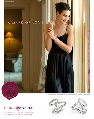
Retouching Percy Marks' new print campaign produced by Creative Guru Richard Stenlake of Made Agency.

French Week


This last week has been French week. First (top image) this perfume bottle retouch for the Canturi Fragrance launch at Myers in Brisbane and Melbourne, and then a large project for French based photographer Richard Powers who shot this new shopping centre "YR Printems" for Yabupulseberg, winners of the Platinum Circle Award and Designers of the year (Contact magazine) in New York.

Richard has Just launched a new book " Living modern: the sourcebook of contemporary interiors" here is a link to some sample pages http://www.richardpowers.co.uk/photo_template.php?id=33&page=0