Thursday, November 25, 2010

Christmas Card

Every year I do an Xmas card, I usually try to incorporate some retouching skills so that it also serves as self promotion, something I don't have allot of time for.

This years effort is my first go at 3D rendering (the ocean, the rock and the tree) I then added the surf, the beach, the bird and the swimmer and the sand in the shape of Australia on the top of the rock.

So in effect this is not a photograph, but a illustration with photo elements added (the bird and the swimmer)

Wednesday, October 27, 2010

Water Techniques


This is my own solution to creating sparkle and shimmer on water, which I own up immediately as labour intensive and a pain but it works and I have used the same technique now on two jobs.

If I get enough requests I will post the free how to on this blog. email domini@bitdepth.com.au and tell us how much you want to sparkle!

Monday, October 25, 2010

colour

I once stood up at a David Harradine presentation on colour management and argued the point that he had recommended the setting absolute colourmetric ( this is found in pre Cs colour preference rendering intent in the colour menu) instead of perceptual, if your not savvy with colour management and the stuff you have just read made your eyes water the point is colour is PERCEPTUAL.

Here are four versions of water colour.
The digital camera, a Hasselblad H3DII-31, has captured hopefully as accurately as the manufactures claim (Image 1)

Images 2,3 and 4 are my attempt to satisfy the client who has a visual memory of what the ocean looked like (or wanted to look like)

I don't find this odd, I work for clients in China and am often correcting the colour of the water as Im told it is a unique colour.
Though i have never seen it in person (the China sea) im certain this is true because as anyone living here in Australia who has visited east and west on this vast continent will tell you the Pacific and Indian Oceans are a totally different colour.
Though I live in Sydney (east coast) the Indian ocean won my heart (west coast,) aka Western Australia, ah the colour, well you just have to see it....

p.s.: the client chose image 2, how many of you picked 4, I wonder?

Tuesday, October 19, 2010

Nurofen

Photographer Tom Holland shot this for Ad Agency EURO RSCG's Nurofen campaign ( the OK's on the project had to come from the UK) We were in the middle of Sydney's worst weather period. I think sometimes overseas clients have this idea that Australia has but one season, summer, but alas it is not so, the weather was bleak. My magic was to remove most of the cloud, get some blue back into the sky, strip in a new water scene, remove a vase of tulips and make that water sparkle baby!

Jones

Shot by Tarsha Hosking. Keeping Up With The Joneses, Channel Ten's new reality show.
My bit of post work magic includes removing the bands binding the Crocks choppers together. (See retouching can serve the community and protect the young from harm.)

Bridal

Liz Ham shot this Lisa Ho Bridal catalogue. My task, mood, consistency of tones, perfect skin and creaseless garments.

Shoes

New Betts campaign shot by Fabrizio Lapari. Great lighting technique by Fab, this is a good example of things that can go awry at a shoot, some shoes were just to big, my job make 'em fit.

Lifestyle

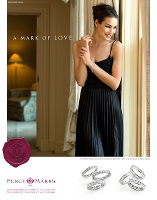
Retouching Percy Marks' new print campaign produced by Creative Guru Richard Stenlake of Made Agency.

French Week


This last week has been French week. First (top image) this perfume bottle retouch for the Canturi Fragrance launch at Myers in Brisbane and Melbourne, and then a large project for French based photographer Richard Powers who shot this new shopping centre "YR Printems" for Yabupulseberg, winners of the Platinum Circle Award and Designers of the year (Contact magazine) in New York.

Richard has Just launched a new book " Living modern: the sourcebook of contemporary interiors" here is a link to some sample pages http://www.richardpowers.co.uk/photo_template.php?id=33&page=0

Tuesday, September 28, 2010

Ferrero

Photographer Jason Busch shot this for Ferrero. Post shoot the client wanted the box filled and and the straw reduced. The glass and roses were added from another frame, but the sides of the box a marble top had to be created / illustrated.

Monday, May 3, 2010

Lifestyle


Shot by Jamie MacFayden, the client decided to reuse this image but now needed a vertical format, a difficult image extension as perspective of the decking cannot be stretched but needed to be drawn in at the right angle plank by plank. Also had to illustrate some legs on the bbq.

Medical


Brief: create from scratch a dissolving tablet in the shape of text supplied. My good friend and ex Phototechnica colleague and a die hard film advocate shot a tablet dissolving for me on 5x4 format and I used this as a reference for texture and effervescence

Travel


Photographer Geoff Lung had a rotten weather day and no time left. My commission, make it summery and appetizing, featured on my website www.bitdepth.com.au

Furniture


Top shot is the original unretouched image.
This was originally retouched in house . The client was unhappy with the reproduction which was very muddy and I was called in to redo the post work with the emphasis on the sofa reproducing as clean and crisp as possible. I would have to say this is very common now, I no longer know any retouchers that were actually trained in the art of press re-pro, a lost art along with all the film separation guys.

Fishing


Original Image is on top, from around 10 images supplied at varies exposures I had to comp in sky, water, and create the mood, Jason Loucas, the Photographer had a clear vision of the dramatic image he wanted, it became a little more complicated when the client advised they needed image on the left to fit their add format which ended up being more than a third, a major effort requiring illustration skills.

V


A recent project for Channel Nine, Warner Bros supplied the illustration of the ship, which then had to be stripped into a library shot of Sydney plus extra shots for water, foreground, and sky, then manipulated to match the style and lighting of this new Sci Fi TV series ( a remake of the original 70's show) I had to do the same for Brisbane and Melbourne. These where intended for billboard but I never saw one actually up, did anyone out there see this in print?

Advertising

Photographer Steven Chee shot this campaign, can't remember what it was for, I had to create the zip effect.

Fashion 3

Client Lisa Ho wanted to use this shot on the left but change the dress to a semi see through gauze white,not as easy as it may look.

Fashion 2

Photographer Fabrizio Lapari shot this Betts campaign and I was commissioned to do the post work. The Ad Agency wanted the ability to reposition the talent to fit different formats so all had to be stripped in and kept as layers. The tricky part was achieving the transparency of the clothes allowing background to show through and all flyaway hair to work against any background changes made. The key method to making this work was the use of blending modes and masking.

Fashion

I get this quite often, no detail in the blacks. Unlike the problem of a digital image being blown out this is easily remedied, there is an amazing amount of detail hidden in the digital data and with a few masks and blending modes its soon fixed.

Sunday, May 2, 2010

Cosmetics


A tricky masking problem. Brief was to make the text more legible